Magazine comparison essay
The names of my magazines I have chosen are “KERRANG!” which is mainly a magazine for people who like rather heavy music such as metal and rock. It appeals to this target audience by having dark bold colours and a very “I don’t care” style about it, its target audience is around 15-28 year olds and anyone who likes this kind of music. The mask head on “KERRANG!” looks like it had been printed and also it has got white lines going through the font of the mask head which as I said before adds to the casual theme of the magazine, also “KERRANG!” has a explanation mark which hints the music which it features are of a loud nature. However on the other hand the magazine “Q” is a more mainstream magazine and trys to appeal to more audiences, so it is not going to specialise in any kind of music and so this is going to reflect in its front cover aswell, so compared to “KERRANG!” which is specialising in Heavy stuff, It is rather plain and empty looking. I think the name and the logo “Q” is quite sensible for this magazine because it is a very mainstream magazine so that the “Q” doesn’t really apply for any specific kind of music and it’s also very easy to remember.
The layouts between the two magazines vary a lot because of there two vary different styles and genre, both magazines have taking advantage of the left third, “KERRANG” has made sure that the “free posters” so that it can be seen on the news agent self., while “Q” has doe there magazine so that the “The loud issue” is on the left third for the same reasons. The main images on these 2 magazines are very similar, they are both consisting off a band at staring, one being “Metallica” and the other being “biffy clyro” I think the “KERRANG!” image is better due to it the faces being bigger and the nice shading on the face of the lead singer, I didn’t like the picture of metallica because I think they should of zoomed in on to the faces a little bit for and have and more interesting background then just white, form previous magazines from Q have the white background is a kind of tradition and for more “KERRANG!” they like to us more dark backgrounds to go with there more specialised music genre type
My conclusion is that “Q” is the better magazine as I think that it is better designed then the “KERRANG!” magazine, and I prefer it nice tidy and clean design, which is a stark contrast to the “KERRANG!” magazine, how ever it is there design choice to go with the style of music that there magazine writes about, another important factor is that this “Q” magazine is stands out more then the “KERRANG!” magazine which I think makes it more appealing for the general audience.
Thursday, 5 November 2009
Wednesday, 14 October 2009
Report.
The names of my magazines I have choose are “KERRANG!” which is mainly a magazine for people who like rather heavy music such as metal and rock. It appeals to this target audience by having dark bold colours and a very “I don’t care” style about it, its target audience is around 15-28 year olds and anyone who likes this kind of music. The mask head on “KERRANG!” looks like it had been printed and also it has got white lines going through the font of the mask head which as I said before adds to the casual theme of the magazine, also “KERRANG!” has a explanation mark which hints the music which it features are of a loud nature. However on the other hand the magazine “Q” is a more mainstream magazine and trys to appeal to more audiences, so it is not going to specialise in any kind of music and so this is going to reflect in its front cover aswell, so compared to “KERRANG!” is specialising in Heavy stuff, it is rather plain and empty looking. I think “Q” is sensible for the magazine because its mainstream so that the Q doesn’t really apply for any kind of music and its also very easy to remember.
http://www.metallica.com/ivergence/image/Q253_COVERmd.jpg
http://www.biffierthanthou.com/photos/press/Kerrang%20Cover-thumb.jpg
Thursday, 1 October 2009
Thursday, 17 September 2009

Tuesday, 15 September 2009
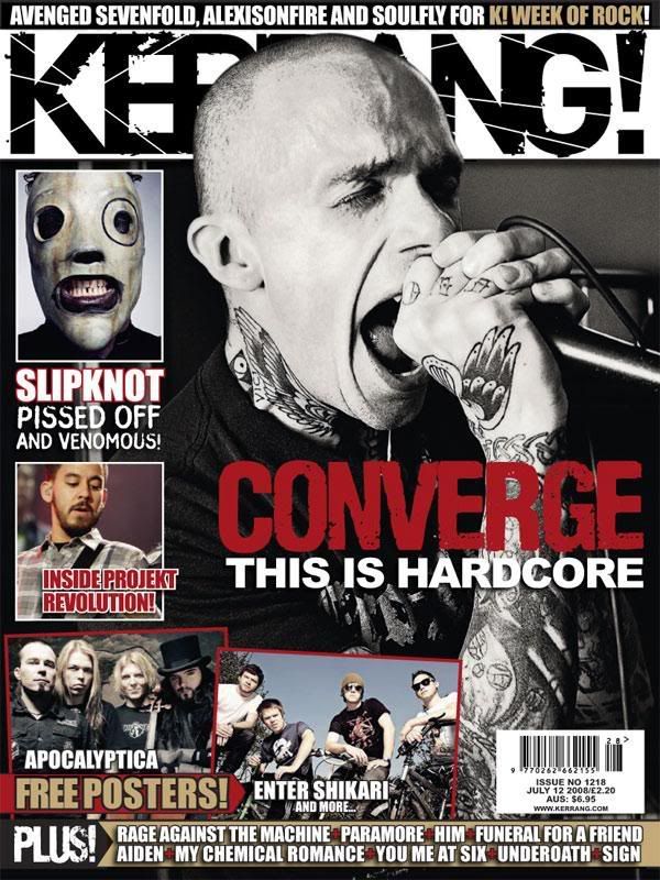
This is my favourite because its the only music magazine I ever have read, the title "KERRANG!" has be made so its looks like it was printed with a block printer, which makes the edges of the letters in some places to expand and contract then it is usually in standard writing. There are also write lines going through the "KERRANG!" which makes the title seem more rebellious and more belonging to the music that "KERRANG!" is about. The title's font is large to make it more noticeable, however in my opinion the title in the middle of the page “converge” is more noticeable because it’s in the middle of the page and it is in red, and another thing that makes its more noticeable is that “KERRANG!” is slightly covered by the mans head, “converge” is properly the main article in this magazine.
Around the edges of the main theme of the front page IE the man singing in to the microphone, are smaller less important things in the magazine which take up smaller space in the magazine so they take up smaller space on the front page for example the “free posters!” and “enter shikari” . they all come with a picture so they not of least importance in the front page.
At the very top and bottom of pages are more advertising of articles in the page, I think they are at the bottom and very top of the page as they not of much importance and not get in the way of the main story.
Subscribe to:
Comments (Atom)